Create
a New Visualisation.
OR
Select an Existing
Visualisation.
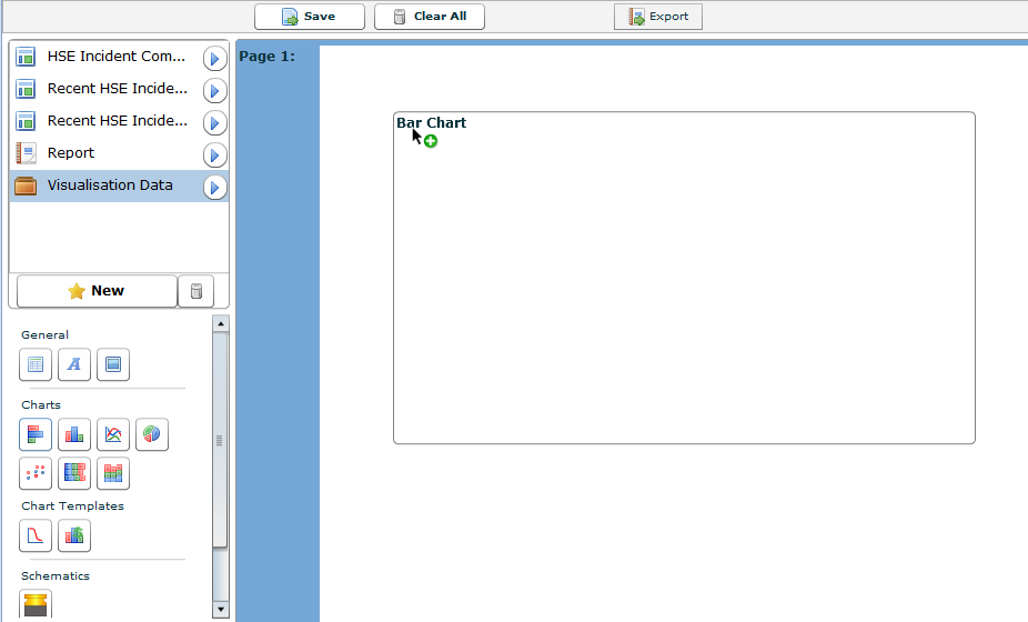
Click one of the following and drag it onto the visualisation canvas.
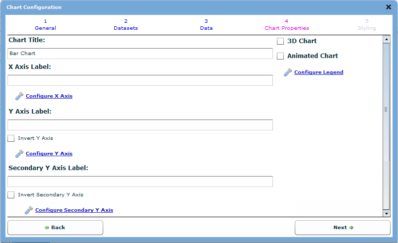
 Bar Chart/Graph - A Category (text) versus
Value (number) chart with bars that extend horizontally across the
screen. A bar chart can be configured as a normal bar, a line, a scatter
or a stacked bar chart.
Bar Chart/Graph - A Category (text) versus
Value (number) chart with bars that extend horizontally across the
screen. A bar chart can be configured as a normal bar, a line, a scatter
or a stacked bar chart.
 Column Chart - A Category (text) versus
Value (number) chart with columns that extend vertically up the screen.
A column chart can be configured as a normal column, a line, a scatter
or a stacked column chart.
Column Chart - A Category (text) versus
Value (number) chart with columns that extend vertically up the screen.
A column chart can be configured as a normal column, a line, a scatter
or a stacked column chart.
 Line Chart/Graph - A Value (number) versus
Value (number) chart with lines that intersect the dots between the
data points. A line chart can be configured as a normal line or a
scatter chart.
Line Chart/Graph - A Value (number) versus
Value (number) chart with lines that intersect the dots between the
data points. A line chart can be configured as a normal line or a
scatter chart.
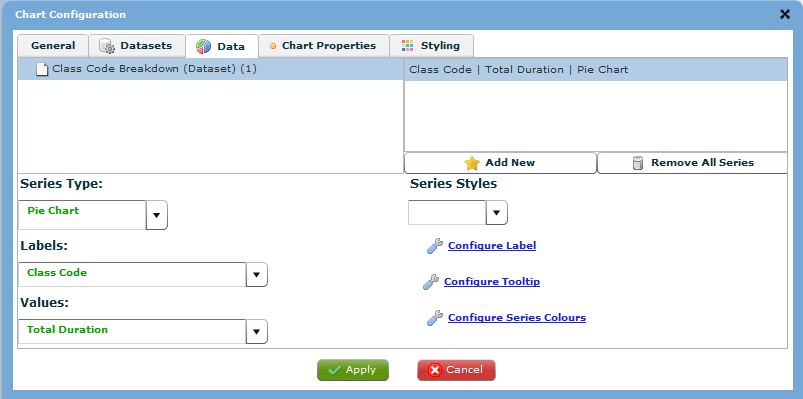
 Pie Chart/Graph - A Category (text) versus
Value (number) chart in which each segment of the pie represents a
percentage of the total value of all the segments. Each segment
is made from one row of data. A pie chart cannot be configured as
any other type of chart type.
Pie Chart/Graph - A Category (text) versus
Value (number) chart in which each segment of the pie represents a
percentage of the total value of all the segments. Each segment
is made from one row of data. A pie chart cannot be configured as
any other type of chart type.
 Scatter Chart - A Value (number) versus
Value (number) chart that each point represents one data point. A
scatter chart can be configured as a normal scatter or a line chart.
Scatter Chart - A Value (number) versus
Value (number) chart that each point represents one data point. A
scatter chart can be configured as a normal scatter or a line chart.
 Stacked Bar Chart/Graph - A Category (text)
versus Value (number) chart where the points under one series are
stacked on top of each other and extend horizontally. A stacked bar
can be configured as a normal stacked bar, a bar, a line or a scatter
chart.
Stacked Bar Chart/Graph - A Category (text)
versus Value (number) chart where the points under one series are
stacked on top of each other and extend horizontally. A stacked bar
can be configured as a normal stacked bar, a bar, a line or a scatter
chart.
 Stacked Column Chart/Graph - A Category
(text) versus Value (number) chart where the points under one series
are stacked on top of each other and extend vertically. A stacked
column can be configured as a normal stacked column, a column, a line
or as a scatter chart.
Stacked Column Chart/Graph - A Category
(text) versus Value (number) chart where the points under one series
are stacked on top of each other and extend vertically. A stacked
column can be configured as a normal stacked column, a column, a line
or as a scatter chart.
 .
.
 .
.
 .
.
 .
.