Configure the series colours in the charts to help explain the information being displayed with colour description.
To begin configuring the colour settings for this series, locate the ‘Configure Series Colours’ button on the screen and click it.
Clicking this button will produce the tooltip configuration screen. Based on what data is selected, the following screens will be shown:
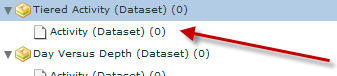
Tiered Data
This screen allows the series to be coloured as well as apply colouring to the items under each series.
OR
Flat Data
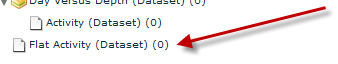
This screen allows the items in the series to be coloured.
When working with tiered data, click  to
colour the items in the series.
to
colour the items in the series.
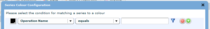
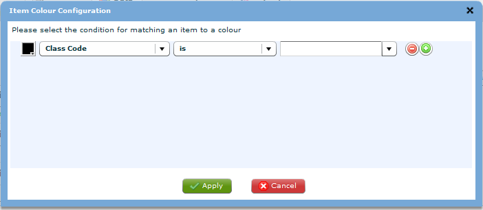
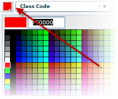
The colour settings work through criteria matching the X-Axis (or Labels in a pie) to set a colour. You must first select the colour of choice.
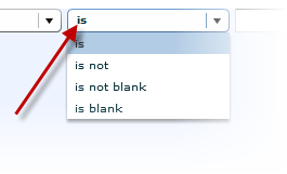
After the colour is selected, select the condition you wish to use. Depending on what type of field is being used in the X-Axis this condition list may vary.
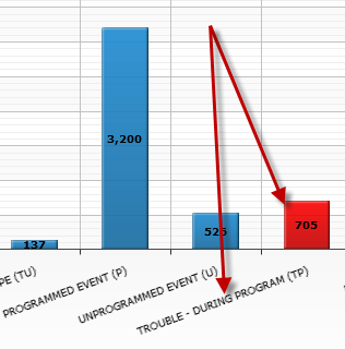
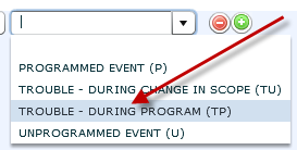
After a condition is set, the value for this criterion must be set. In this case we want all items with an X-Axis value of TROUBLE – DURING PROGRAM (TP) to be the item that is coloured red.
When all the criteria have been configured click the  to apply the changes or click the
  to cancel the changes.
If the colour configuration is applied then the coloured item that matches the criteria will be shown in red.