The Data tab allows for the data in the chart to be designed.
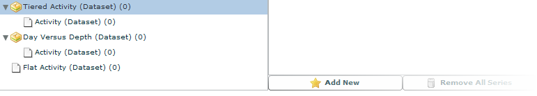
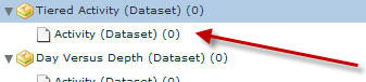
There are two different types of data available in the Data tab. When using Tiered data for a chart, always select the bottom level, unless there is a specific need for the data on the parent level. When using flat data only the one level is available.
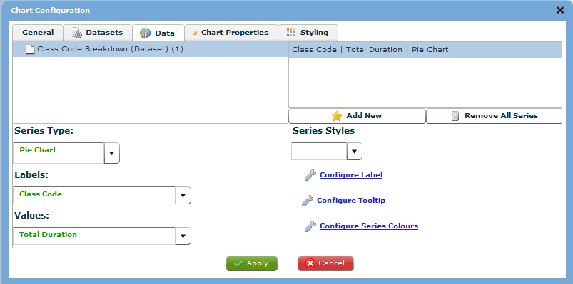
The display differs for different chart types. If the chart created was a Pie chart then the ‘X Axis’ label would read ‘Labels’ and the ‘Y Axis’ label would read ‘Values’. Additionally, if the chart type was a Pie chart then the ‘Y Axis #’, ‘Padding between points’ and ‘Padding between groups’ options would be hidden.
Chart Data
When using Tiered data for a chart, always select the bottom level, unless there is a specific need for the data on the parent level.
When using flat data only the one level is available.
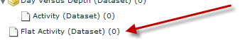
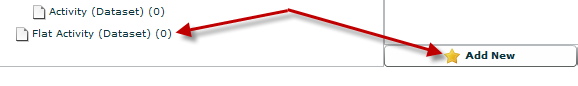
After locating the dataset you wish to configure chart data for, select the item in the tree then click ‘Add New’
After ‘Add New’ is clicked the bottom section of the screen will be populated.
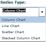
Series Type
The Series Type drop-down list allows the selection of other valid configuration types. This list is based on the type of chart originally selected to create.
A common configuration, especially for cost charts is to crate a column chart; however, have the series rendered as a line chart.
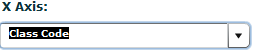
X Axis/Label
The X Axis (or Labels in a pie chart) drop-down allows the selection of any fields configured in both the dataset and query combined.
If this is a Line or Scatter chart then only numerical values will be shown in the list.
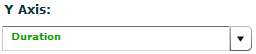
Y Axis/Values
The Y Axis (or Values in a pie chart) drop-down allows the selection of any numeric fields configured in both the dataset and query combined.
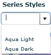
Series Styles
The Styles drop-down list allows the selection of a lighter or darker style set provided by the AnyChart technology. If no style is selected, the original style set defined by AnyChart is used.
Label Settings
Click 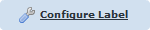 to start creating and editing labels.
Note: See Configure
Labels (Charts) for more details.
Tooltip Settings
Click 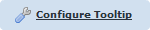 to start configuring colours.
Note: See Configure
Tooltips for more details.
Colour Settings
Click  to start creating and editing labels.
Note: See Configure
Series Colours for more details.
Y Axis #
The Y Axis # drop-down list allows the user to assign the current series to an axis. VisNet 1.2 supports two Y Exes.
Note: One series MUST be assigned to the first axis.

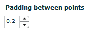
Padding Between Points
The padding between points allows the user to space the points on a graph so that the information is not crowded together. It allows for easier reading.
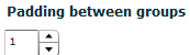
Padding Between Groups
The padding between groups allows the user to space the different groups or categories in the chart.